Welcome to our website. Neque porro quisquam est qui dolorem ipsum dolor.

Lorem ipsum eu usu assum liberavisse, ut munere praesent complectitur mea. Sit an option maiorum principes. Ne per probo magna idque, est veniam exerci appareat no. Sit at amet propriae intellegebat, natum iusto forensibus duo ut. Pro hinc aperiri fabulas ut, probo tractatos euripidis an vis, ignota oblique.

Ad ius munere soluta deterruisset, quot veri id vim, te vel bonorum ornatus persequeris. Maecenas ornare tortor. Donec sed tellus eget sapien fringilla nonummy. Mauris a ante. Suspendisse quam sem, consequat at, commodo vitae, feugiat in, nunc. Morbi imperdiet augue quis tellus.

Thursday, 6 January 2011

Our Final Interior Design Exhibition 2010(Part One)

Every year,our college always held an Interior Design Exhibition to show to the public about our creativity in doing our work, how to attract students to join the course and to experience criticism from the public. Also to show how much we knew on the project we are doing and how to handle every remarks from the public. By this exhibition, we also try to attract the attention of some companies or architects to see if they are interested to take us for future jobs.

Our task start at mid July 2010. As usual we were given a brief on this project. Also some choices were given: restaurant,coffee house, library, nursery, showrooms, boutique,spa center,sport center, a theatre, studios and art gallery.

The first thing to do is our feasibility report. The site is at lambak kanan, BSB. There was an existing public library there.We were ask to imagine the library hasn't built and in exchange with our building.Surrounded by houses with a nearby school.Look at the images below of the site.


The image above is the existing Lambak Kanan's public library. As you can see the image below it is the housing area around it.

From the location I review and list out the advantage and disadvantages of the site,I have decided to make a furniture showroom.

Reasons:
            - The site provide drainage in case of flood.
            - Bigger space for parking and loading.
            - Located around housing area. Good for showrooms.
            - No competition to compete with nearby.

To include in the feasibility report, I make my own visit to some of the furniture showrooms around here. I went to court furniture, DELI furniture, HAUS furniture,Da Vinci and Nazmi furniture. There is more but I didn't got the chance to visit them. Showrooms are really an interesting business with lots of interior designing involve. I got inspired by some of the showrooms i visit. I was most inspired by the Da Vinci showroom.It's very elegant with a rich modern classic look. Colorful rooms with decorative structure.Even the building caught my attention.


The building is base on victorian structure. From this it could already attract the public. More fancier, when we enter. The staff describe was kindly to tell me abit of the history of this building and what really interested the customer,especially when it comes to luxury. So I didn't make a wrong choice planning to make a furniture showroom.

After the feasibility report is done, it was time to look for concept. So I could continue with my research and development. I wanted to find something that connects with an elegant and a unique building for my showroom. I took me times to choose. Then one day, I saw Miley Cyrus music video called '' Can't be tame'' where I see her in a huge birdcage. My mind suddenly 'click'. A birdcage. Birdcage does have a beautiful design in victorian times. So I surf in the internet to know more about birdcage. Surprisingly, I found out that during the Victorian era, they use decorative birdcage as a main decoration in their livingroom. It has a  connection to what I was looking for.

I made a model of a birdcage using a silver metal string.Can also be consider as my mood Board.I stich and tied up to make it look like a birdcage.But its not an exact one.


 After I have done my research on it, I carry on with my development.Below is the images of my sketch development.


I never do my development in order. Whatever went to my mind I just sketch it.I don't like wasting papers so I drew it small. The final design I did was by cutting the cage into half,slanting. Than twist it. The result is the image below.


This is how it looks like.I took this picture from my working drawing using AutoCAD. I add the details,the measurement,the windows and the entrance. Below are the ground floor plan and the first floor plan from my working drawing.


Ground floor include 8 showrooms with different themes. The reception is at the end.I wanted the customer to look around the showrooms first and can ask the receptionist afterwards. I also include male and female public w/c.
First floor, I include 4 showrooms. There is also rooms for staff connected with a dry kitchen.

I tried making the design with Victorian style decoration to show the luxuries with a modern touch.

This is all that I could show for what I did before the exhibition. I will show my sketch scheme,my model, my business card ,my banner and how I'm doing with my exhibition

Tuesday, 4 January 2011

Last Minute work

During the time we did the coffee house project, our computer teacher gave us another task for his class. His project is to do an exhibition stand in 3D.Area given around 5m x 4m. This exhibition we were ask to do is a sport exhibition with a brand. For example,Nike, Adidas, Puma, Yonex and many more that is related to sports.

My sport brand is CALLAWAY. One of the most popular golf brand. I ask my dad to describe me everything that is needed to know about golf equipment since he is also a member of a golf club in polo club,Brunei.

I look up in the internet and found many types of foot wear,accessories, golf balls and many more. What I need to know is how to put all of the product to fit in a small area. But I tried.

First I focus on the symbol and the product design. It has this shape that looks like a bee hive in a modern metalic design. So I tried putting that in my exhibition stand. The result is this. See the images below:-


The orange color is base on the brands theme color as I focus on its website.The middle is where the golf ball is displayed. the left side is the apparel section. Next to it is the footwear section. Carry on to the right side is the golf club display with a custom made mini golf yard. In this task,we didn't put any of the products  our teacher just ask for the exhibition stand.Below is how I put in as my presentation package.


That was the last project we did and will carry on for the final exhibition project before we leave school. Actually there are more project I did before but didn't have the pictures to prove. But I will put my reference list to show you all and ask them what have I done for the 2 years there in Maktab Teknik Sultan Saiful Rijal.

Monday, 3 January 2011

3 Dimensioning the art

Our final project before we have our Interior Design Exhibition.

The sixth project is to make a coffee house on an empty area in Kiulap,  Bandar Seri Begawan. It was around 32m x 60m.We went to the area and made a site survey.Noted the facilities and the business competition around.


 The image I took from the site.It was empty and deserted but has many facilities.It has a fire brigade,drainage, boat stop, shops, bank and not far from the mosque,the hospital and the fire station.

All the images and the information about the area, we put in our feasibility report.We were given into groups.Each group has six member.We also collect samples of the grass,the rocks and the ground.We have to dig it deeper to see if the ground suited to be use.It was perfect.But when we did a presentation on our feasibility report,we got just pass because there is a lot of things we didn't include.It was our first time making one and we did our best on it.

When the feasibility report was done,we started focusing on how to make our coffee house with a themes.My concept is a star. A star has many different shape,but I chose the usual five pointed star and create it in a unique way. Below is my Mood Board for my coffee house.

My mood board was inspired by the glamorous red carpet style. I wanted to make my coffee house an luxury ,fun and high class. Not just restaurant can rated into a five star. Even a coffee house can. I wanted to put some entertainment in my coffee house by adding a mini stage for the customer to enjoy rather than just hearing through a radio or from a CD player.

A star doesn't mean just by the shape. It can also mean a Celebrity. Let the customer feel the star in them when they walk in and enjoy the celebrity lifestyle.

When I started to do my development, I had some problems creating my building. My teacher didn't agree on my idea.It was just a simple building with a shape of a star. I lost my hope. I had the idea but I don't know how to create it. Then one of my teacher who teaches architectural studies taught me what he did before to get a n idea. He drew two star and cut it. Then he folded each corner and put the other star on top. It did look like a star but in a unique angle. So I try and check the internet for more inspiration. I got inspired by a sharp edge building by Daniel Libeskind. His creation was unique and sharp. I was amaze and try to draw my building.

WD 1

WD2

The above image are some sample of my working drawing of my building. WD 1 is the Ground floor plan for my coffee house.If you focus it, it still look like a star shape. Inspired by the two folded star cut out paper. WD2 is the front view of my building. Still, with the star shape design. Inspired by Daniel Lisbeskind sharp building. With a triangle shape window and aluminium stripe layering it.

Below is my 3D exterior visuals I did using 3D Max 2009.

The side view


The Front View


The blue colour building was inspired by he dark blue nights of the sky. Also to give a comfort feeling. Most of the building around it are just light color building. So I gave a color that people can spot from far. The most unique part if people see from top view,they can see a titanium star shape roof.Below are the other visuals.

First Floor-
The first image is the sitting area for outdoor area. Usually for people who intends to smoke or enjoy the outside view.Second image is the chilling area,include sofa and coffee table. Consider a private area. Divided into two rooms.

Ground Floor-
The sitting area with a side bar at the corner to serve beverage.

The exterior image is to show how it would look like with parking area.

This is my last project for 2010. Will start another one for the final exhibition. But before that I will show another project I did for my computer subject that I did in the same time with this project.

Sunday, 2 January 2011

Upgrading talent

After a year and a half, we did things manually.In our final year 2010, we can do our project using 3D software. At least a much better view to see the real visuals.

The fifth project we did was to make a reception desk but include the space given.Only ground floor area. Imagining the place for customer service center.We were given four different types of concept to choose. eg. Egyptian, Water, Japanese and Brunei.

I chose Japanese concept because of their unique culture. Their live style,their language and their noble sports. I wanted to make the place a Japanese art and culture center, where people can learn the cultures of Japan.My concept for the reception desk would be the Samurai sword. Samurai sword is also known as 'Katana' in Japanese.A traditional sword worn by an honorable Samurai warrior.

The above picture is the first Mood Board I did for this project. A Japanese shrine with Sakura trees to show the Japan's environment. I also added some of the traditional fashion, foods and sports. But my teacher didn't agree on this Mood Board.It wasn't clear with the connection to the area. I agreed with him and make a new one.See the image below:-


I was inspired by a drawing I found in the internet where a Samurai was swinging his sword during sunset. So I tried to visualize it and this is what I have created. The trees shown in the picture are the Japanese Maple trees. Also known as ' Bonsai' in Japanese. I wanted to use the trees for my interior. The two samurai sword I use newspapers. I roll and flatten it.Paste it with tissue mix with PVA glue.Then spray it black.Inside I made the sword using a mounting Board and spray it silver.But sadly one of the sword was accidentally rip by my friend.I also wanted to use the color of the sunset for the interior. Finally my teacher likes it.

After I have done my research and my development.I did my 3D using Revit Architecture2009. The result was satisfying but it takes time to finish it.I was one day late.

My 3D presentation package. The background I put a blended samurai sword to show my concept. In this package I include a plan, one front elevation and two sections.I make the building gray to give some contemporary look with some traditional look.
The Left visual is the entrance. The interior has a warm texture to bring the warm colors of sunset. With Oak woods for the wall,making it contrast with the black granite tiles.The X shape floor are the two blades connecting together.The old Maple plant trees brings a complete look to the interior.

The right side visual is the reception desk.Three sided samurai blades at each corner,to separate the reception desk.Huge blades pop out from the floor to show the concept and an aggressive feeling.

My first 3D was a success but less detail. But I did my best and gave everything that was needed for the project.

Getting Creative Part 2

This project was in 2009 after the two last project.

The Fourth project is to make a salon with a retail shop. Base on our old school building. It this project,the building exist with a permanent structure. We only need to decorate it and change some structure to go with our themes. I have some difficulties on this project. Most of the concept that I wanted to use was already taken by some of my classmate.So I did not use any concept but using a rich color themes.

Color themes:

                  Purple- The color of royalty,very versatile.The ability to stimulate creativity.
                  Mint- Fresh with a cutting edge look combine dramatic for an intense sensory experience.

What I know about salon, it is near to a spa treatment. It's where we relax and pamper our hair and body. So I wanted the building to have a bright and in the same time a fresh welcome.

For the retail shop, I make as a shoe shop. Not only our hair needs treatment, of course they need something to feel confidence when they walk out. Especially women, they would love to try things that would go with their new look. Shoes can also bring confidence.


This is my presentation package on my salon and retail shop.Retail shop on the Ground Floor and the salon on the First Floor. The presentation package include Ground&First Floor, Two sections and two elevations.I am sorry for not showing the visuals. I didn't have much time for this project.But I will try my best someday to make it a better package.

After year one had finish which is from July 2008-2009, we had our six month industrial attachment. Each of us was divided individually. I was located in the Ministry of Religious Affair(MORA) for the building and maintenance section. From there, I learn to work in office and do outside jobs like measuring and taking notes of some resident houses, offices, mosques and schools that needed to be fix.Because those are the jobs of the MORA. For 6 month attachment there, there are some that I make that had been built.

Image IA1                                                                    Image IA2

Image  IA1 is a draft I use using AutoCAD. It was a propose hut for the MORA and the Image IA2 is the proposed hut that had been built.

 Image IA3

                                                                         Image IA4

Image IA3 is the propose draft for my uncle's home coming from haj.I ask help from my attachment place to help built it and it was a success.This was also under the MORA building and maintenance. I follow the colors from our famous Jame 'Asri Mosque. My uncle was please with it even just with this arch can cause nearly $1000.

So that was the end of my projects for 2009 and will continue on 2010 project.

Friday, 31 December 2010

Getting creative part 1

We start this project on 2009.

I have post two of my early projects which I have shown and now I will show the third project given.The third project is to make an exhibition center base on Brunei's local stuff. We were given a measurement of 9m x 12m, for indoor stadium. The first thing we were ask was to do the Mood Board. I wanted to find a concept that connects with Brunei, which Brunei are famous for traditional culture. Then I decided to choose two classic musical instrument which is an acoustic guitar and a violin. Both were string instrument. I remember during High school, we have a 'Gulingtangan' competition where they perform traditional music with a violin. The music fits with it.Adding a guitar that mix well into it.That is how I got inspired for the concept.
This image above is my Mood Board. The blue color background resembles calmness ant the smokey purple resembles harshness. As some songs played using this two instrument can express different symphony but blend well together. The black notes is to show the bonding of traditional and modern songs.

With this Mood Board, I start to do my research and development and get some ideas on each part of the two string instrument.


This are some of the research I have done for the exhibition project. We have to write it manually and I still have to practice that. The definition, the idea, the requirement and facilities for the customer.


               Image 1                                                 Image2

               Image 3                                               Image4

Image 1 is my Design and development for exhibition. Once again, I didn't focus on the cover but I tried putting musical notes to identify my concept. In image2 is my Brainstorm. Before I start doing the development, I have to list out what is needed like the colors, the wall texture,Lighting,flooring,safety and other important requirements. In Image 3 is how I start my development by focusing on my concepts shape and how I am going to deivide each section to locate what area I am going to put in.Also in Image 4.Mixing the two string instrument and cut them half.

 
The image above is the result of my exhibition center. Top view.The guitar and the violin are slice into half.The decorative round shape in the middle is the decorative colored glass.To give colors in the building by the lights. The right side is the exhibition area and the left side is an open space for food court.In the middle of the building are some displays of all the musical instrument use in Brunei.

The image below is the visual I drew and colored. This area is where they ask information of the product
the local sell,opportunity and also for waiting area.

 This are some image of my third project I have done and how I got the idea on how to create the exhibition. There was actually a model I make but I didn't got time taking pictures of it.I apology for that.

Wednesday, 29 December 2010

A step forward to my goal

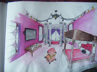
I started my college in the month of July.Where as usual we were given orientation and the introduction of the college.After a few weeks we were there, we were given a brief for our first project.We were given several themes to choose.To create an interior for the given space.Around 4m x 6m.The choices were Calm,Sensual, Aggressive, Superiority,Confusion and Comfort. I chose Sensual which base on my personality.The first thing we were ask to do was a Mood Board. We didn't really understand what is Mood Board from the beginning but lucky our senior show us some example and advice of making one.Mood Board is about expressing our mood on the themes that we chose.I did mine but unfortunately I can't display all my first project since it's still with my teacher.I didn't take any pictures of it because I didn't know it was important to.It was the first mistake for me to be careless.

After the Mood Board,we were ask to do a research on all the themes and our development on how we are going to create the interior.


 I didn't know how to design a cover for my development.I didn't really focus on that, so I just write it simple.


This is how I visualize the sensual interior for my project. I also got Distinction for this.I use sensual colors with some decorative glasses to show the classic beauty.with a lot of pillows to give the softness to the room.

For our second project, we did a project on Domestic Kitchen. We were given the measurement of the spaces and ask to show the ergonomics for the people.But this time we were not ask to do any Mood Board.Only research and development.


This is how the plan looks like. Its around 5m x 5m only. With the measurements and some detail.Below are the visuals for the kitchen.
                             Visual 1                                                                         Visual2

Visual 1 detail
Near the door, I put a serving area with a glass window incase when the cook is cooking, the smoke or smell wouldnt go through.For safety, I put a fire extinguisher in case of  emergency. A custom made Oven and Microwave locate on the wall for faster serving.

Visual2 detail
This is where the cooking area.Next to it is the sink.In the middle is a custom made bar table with four stool.Also with a small sink specialized only to wash hands. With Down lights reflecting through the glasses to make the area more brighter.

This are the two projects I have done which still needed to be fix. It was still an early stage which I have to learn more on how to do it,to achieve better work.

This two project are done and so does the year 2008.Will continue to show more work of 2009 projects.